
In the fall of 2018, three Miami Heat officials gathered at Nike's headquarters in Portland, Oregon, to discuss the Heat's city edition uniforms for the 2020-21 season -- intended then as the season the Heat would move away from its popular "Vice" alternates. After white, black, pink and light blue versions, it would be time for something new.
Hanging on a sales rack in the meeting room was the final version of the light blue "ViceWave" alternates the Heat were set to debut in 2019. The visiting Heat officials thought they looked even better in person. They decided right then to change the topic of their meeting with Nike.
"We have to send this off right," Jennifer Alvarez, the team's vice president for creative and digital marketing, remembers telling her colleagues in attendance -- Michael McCullough, the team's executive vice president and chief marketing officer; and Manuel Fabian, its art director. "We can't just end with blue. There has to be a finale. It has meant too much to our fans."
Since revealing the first "Vice" uniform in 2017, the Heat have sold more than 120,000 "Vice" jerseys from their team store and website -- generating five times more revenue than equivalent sales from the team's three championship seasons combined, team officials said.
The 2018 meeting was not the first time Miami's creative team asserted control over the jersey design process. The Heat originally came to Nike with the "Vice" idea, and politely turned away Nike's alternatives, which included a jersey featuring a palm tree, team officials told ESPN in late 2018.
The Heat team and Nike's designers began brainstorming a fifth "Vice" jersey that would send the line out in style. They wanted something that combined the colors and other elements from all four prior jerseys. They designed a white version with pink trim down one side and light blue down the other, and a "Miami" wordmark on the front in which the shade outlining the letters transitioned in gradations from pink to blue:
"It didn't go far enough," McCullough said. "We wanted to say goodbye in a really bold way."
They took the color gradation motif and made it the centerpiece of the uniform -- with the top and shorts rippling from pink on the right to blue on the left. Their first stab featured white lettering and piping:
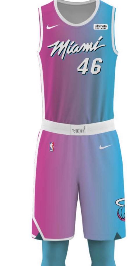
They liked the idea that fans along the sidelines and watching on TV would see different colors as the Heat changed sides of the floor during live play. The Heat would look like a pink army running one way, and then morph into a light blue brigade turning and jogging to the opposite end. Having the gradient flow across the jersey also distinguished Miami's uniform from the Utah Jazz's orange-and-red city edition, featuring a gradient scheme that ripples up and down in wide, rigid stripes.
Heat officials felt something wasn't quite right. The colors weren't popping as dramatically as they had expected. They decided to try black lettering and trim instead of white, ending up with what became their final result -- a uniform they are calling "ViceVersa," and unveiling exclusively at ESPN on Tuesday:
Boom. Stunning. The colors meet in the middle to form a shade of violet, which the Heat will use on T-shirt versions of the jersey:
The jerseys maintain the gradient outlining of "Miami" on the front, arranging it with blue outline against the pink half of the jersey and pink outline against the blue half:
They kept the same font for the "Miami" wordmark, which they took from the signage on the original Miami Arena. The black trim running down only one side of the shorts is a nod to several classic Heat uniforms, including those from the team's inaugural season.
Heat officials knew the gradient cascading across the jersey was daring, even radical. Some did not like it.
"It was polarizing," Alvarez said. "We had some people on Team Gradient, and some people who were not on Team Gradient."
The Heat decided to go for it.
"There may be people who say they don't like it, basura, whatever, and that's OK," McCullough said. "We believe in it. We've heard people saying it's time to move on [from "Vice"], but we'll move on when we're ready."
They are used to some risk. Going all-in on bright pink and turquoise could have flopped. McCullough has joked about feeling "nervous" presenting some of these ideas to team president Pat Riley and coach Erik Spoelstra. "We were very hesitant about going fully pink," Brett Maurer, a Heat graphic designer, told ESPN in 2018.
But Riley has noticed the creative team's track record of producing critical and commercial successes.
When Riley first saw the prototype of this final "Vice" uniform, he looked it over and concluded, "You know what? I trust you guys," McCullough recalled.
"Pat is traditional," McCullough said. "If he could have us wear our blood red uniform every night, he would. That's his uniform. But he trusts us."
McCullough has faced tougher audiences. In 2005, he walked into the locker room to show Miami's players their new alternate jersey inspired by uniforms the Floridians of the American Basketball Association wore in the early 1970s; the jerseys are black with fat pink-and-orange stripes running down one side.
As McCullough stood in the center of the locker room holding a jersey, he felt someone creeping into his personal space. It was Shaquille O'Neal. "I ain't wearing no motherf---ing pink uniform," O'Neal bellowed, according to McCullough. McCullough explained the color was technically magenta, not pink. O'Neal then flip-flopped and announced he was on board.
The Heat also will introduce a court to go along with the new "Vice" jerseys, complete with pink-to-blue gradient in the painted area:
The next step is figuring out a way to make the "Vice" look part of Miami's permanent rotation. (Lots of fans have suggested the "Vice" jerseys replace Miami's traditional look -- which has undergone very little change in the franchise's history -- as the team's standard uniforms, but that isn't going to happen.) Technically, city edition jerseys are supposed to be temporary -- to vanish after a single season. The Heat extended the life of "Vice" by changing the base color three times. Now they are one of several teams arguing for the NBA to loosen the rules on jersey use, and they are confident their coalition will win.
"We have been lobbying the NBA to continue to have these jerseys be part of our ecosystem," McCullough said. "Without giving too much away, I think you'll see that kind of opportunity leaguewide."
(And, yes, they are just "Vice" jerseys -- not "Miami Vice" jerseys, even though they clearly draw inspiration from the iconic 1980s cop show. The word "Vice" was obviously not picked at random; the "Miami Vice" title wordmark was rendered in pink and turquoise. The Heat have been very careful to avoid using "Miami" and "Vice" together in a way that might suggest infringement upon NBC Universal's intellectual property. They did give the NBC Universal legal team a heads-up before they released the first iteration of "Vice" uniforms, McCullough has said.)
The Heat recently worked with the state of Florida to have "Vice"-themed license plates replace an older version, featuring the Heat's traditional flaming ball logo against a white background, as the state's official Heat license plate:
That process took years, and involved the Heat buying back unused older plates from the state to accelerate the transition, team officials said.
"'Vice' isn't just a campaign anymore," Alvarez said. "These are permanent measures. It's an extension of our brand now."
As the "ViceVersa" release date neared, Alvarez found herself reflecting on the nervous excitement she felt upon seeing the initial "Vice" uniform -- the white one -- up close shortly before its public unveiling: "I thought, 'Holy s---, this is gonna be the biggest retail opportunity we've ever had. This is going to be massive.'"
She was right, and this jersey is a worthy capper.