
There's another NWSL season just around the corner, which of course means one thing that fans love to talk about: New kits!
On Thursday, the league and Nike announced the launch of the latest jerseys -- mostly secondary -- that will be sported by all 14 NWSL clubs in 2025. With a wide variety of aesthetically pleasing designs, colors, and subtle nods to their local communities, it's no easy task to narrow down favorites.
Nonetheless, beginning with No. 14 and building up to No. 1 for 2025, here's our NWSL kit rankings for the new season.
Stream the NWSL opening weekend on ESPN+: KC Current vs. Portland Thorns (March 15)
14. NJ/NY Gotham FC
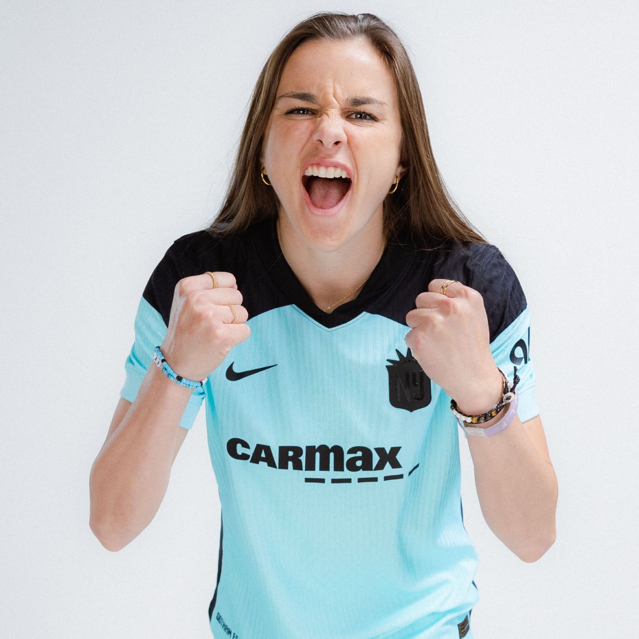
Released as the club's secondary kit, credit is due to Gotham for sticking with an even deeper shade of sky blue, but the simple design of the jersey makes it feel like the most basic of the releases.
It's a kit that appears more appropriate as one for the training ground or for pickup games.
13. Racing Louisville FC
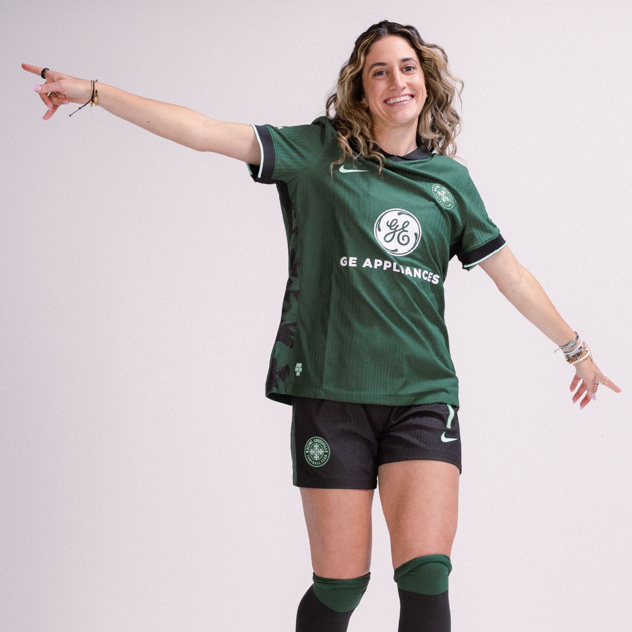
The intentions were good, with a pivot to shades of green for the secondary kit that is supposed to reference themes ranging from the city's tree canopy to "harmony," but the outcome ultimately fell flat when compared to the memorable purples and argyle of 2024. The design is clean, but uninspired.
12. Washington Spirit
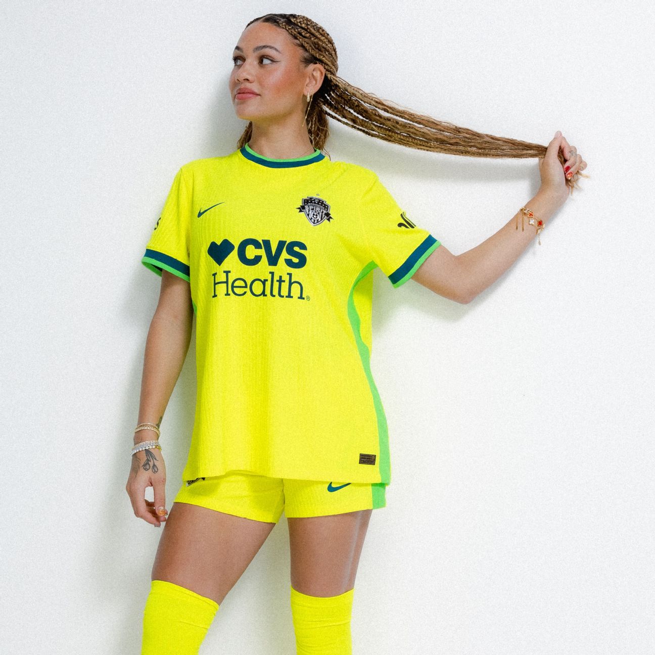
Washington have held onto the distinct yellow for the secondary kit and based on the photos alone, the "Shockwave" jerseys are even brighter than before. It's a bolder color, but the details aren't nearly as strong as most of the others on this list.
One thing's for sure, though: You won't miss these highlighter-like kits on the field. Or perhaps they'll just remind you that you can buy yellow highlighters at CVS.
11. North Carolina Courage
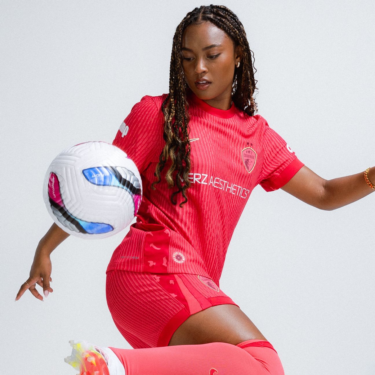
Released as "The Believe Kit," the new secondary from North Carolina will provide plenty of additional belief with U.S. national team player Jaedyn Shaw now sporting the bright design that has subtle rosettes included.
Not a bad mixture of interesting fine points and color, but it's also just a little too plain to make it into the top 10.
10. Orlando Pride
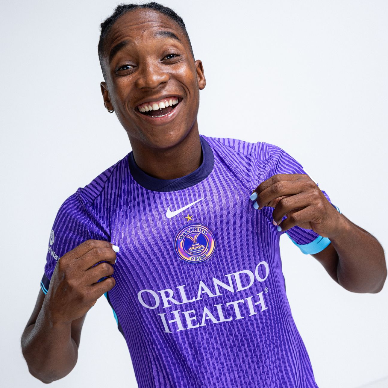
The first of just three primary kits from Thursday's announcement, Orlando have maintained their eye-catching purple that is inspired this season by their original jersey from 2016.
The iridescent crest, celebrating their NWSL Shield and NWSL Championship, is a very strong flex, but is also the highlight of the home kit that is supposed to also be showcasing "elements from some of Orlando's best kits over the last 10 years."
9. Chicago Stars FC
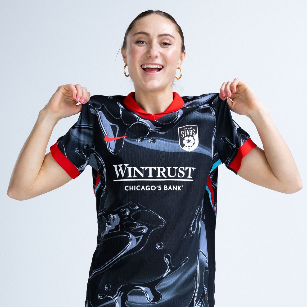
More clubs in American soccer should take risks with their jerseys, and Chicago get points here for the attempt alone, but of the most ambitious efforts this season, it's the most confusing. According to Thursday's release, the liquid metal on the secondary kit "symbolizes the relentless intensity that lies within and the team's ability to adapt to any challenge."
Once again, points given for trying something different, even if it's a bit of a head-scratcher and you're wondering if someone melted Millennium Park's Cloud Gate sculpture.
8. Seattle Reign FC
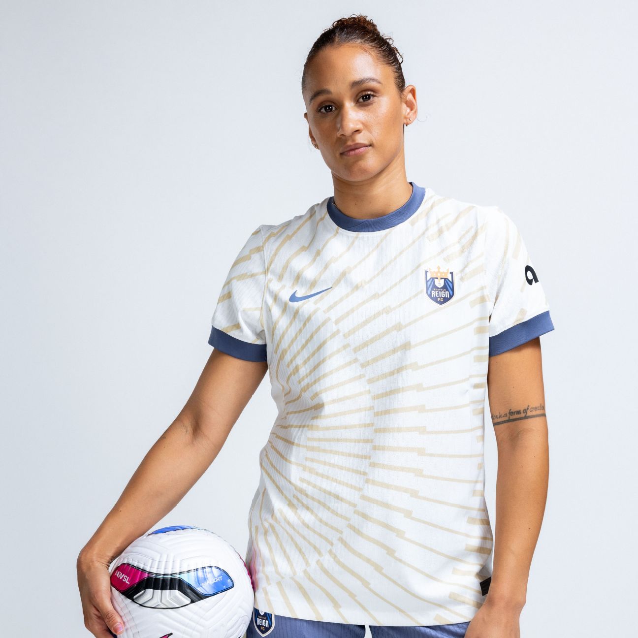
Now things are starting to get interesting.
With lines inspired by Seattle's skyline, the Reign took steps forward this season with their secondary that reinterprets their classic colors. It's different, unique, and will perhaps inspire the squad that finished second-to-last in 2024.
7. Utah Royals
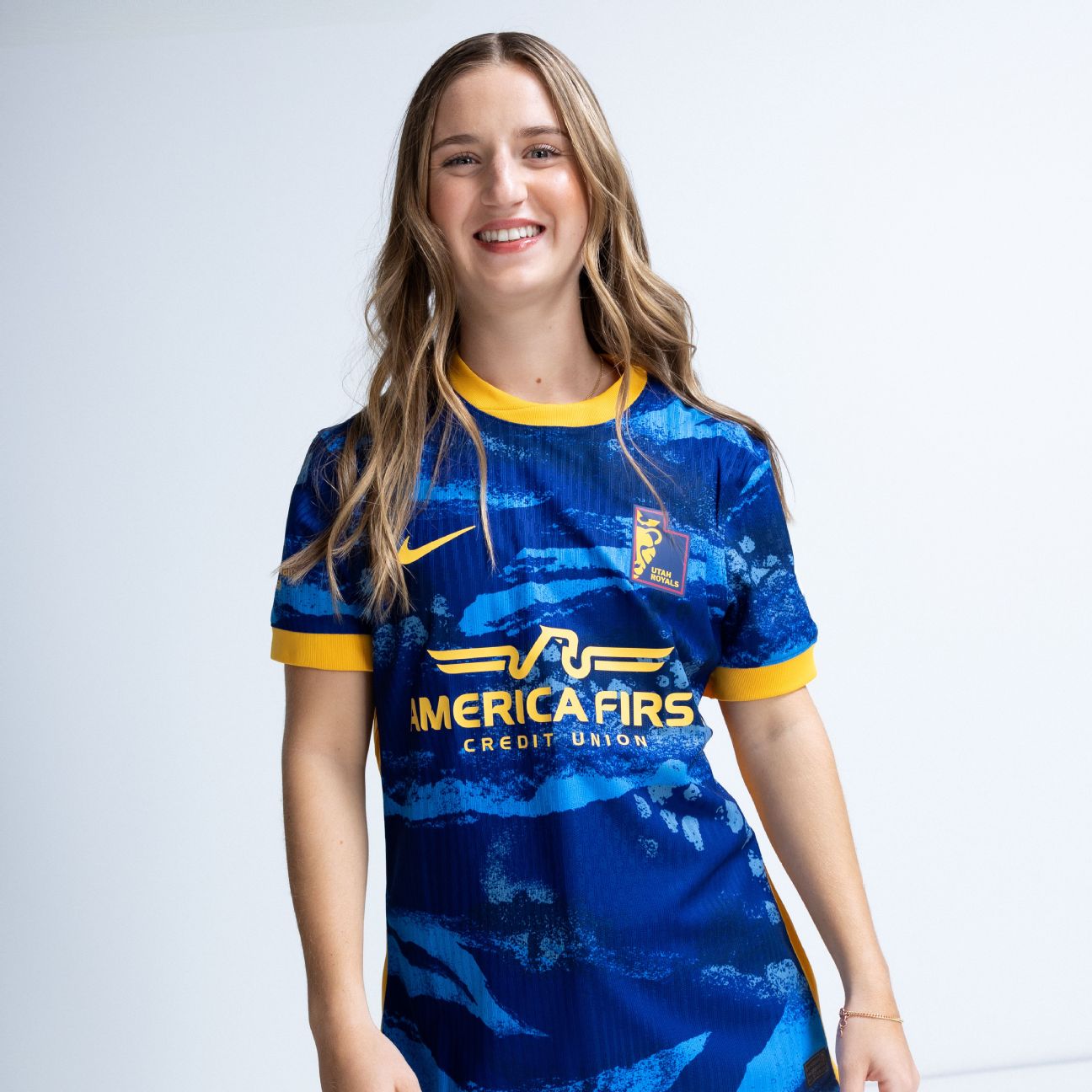
Improvement from last season's secondary? Check. Calling upon local elements such as the Great Salt Lake and the terrain of Utah? Check. Utilizing a secondary mark that's in the shape of your state? Check that one as well!
Some improvements from Utah here, but additional fine-tuning in the overall look is still needed to make it into the top tier of the list.
6. Bay FC
It's difficult to find the right balance of keeping things clean while also trying to stand out, but Bay FC have done exactly that with their new primary kit. The blue and poppy accents work wonderfully together, as do the low-key additions of rolling fog and water.
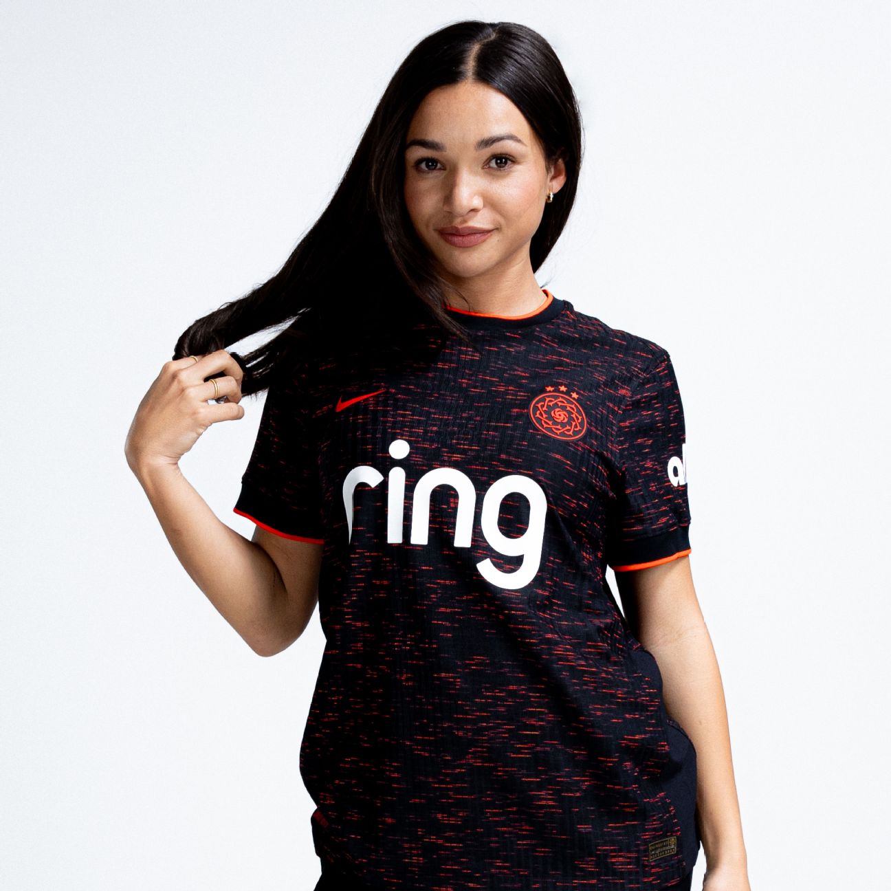
5. Kansas City Current
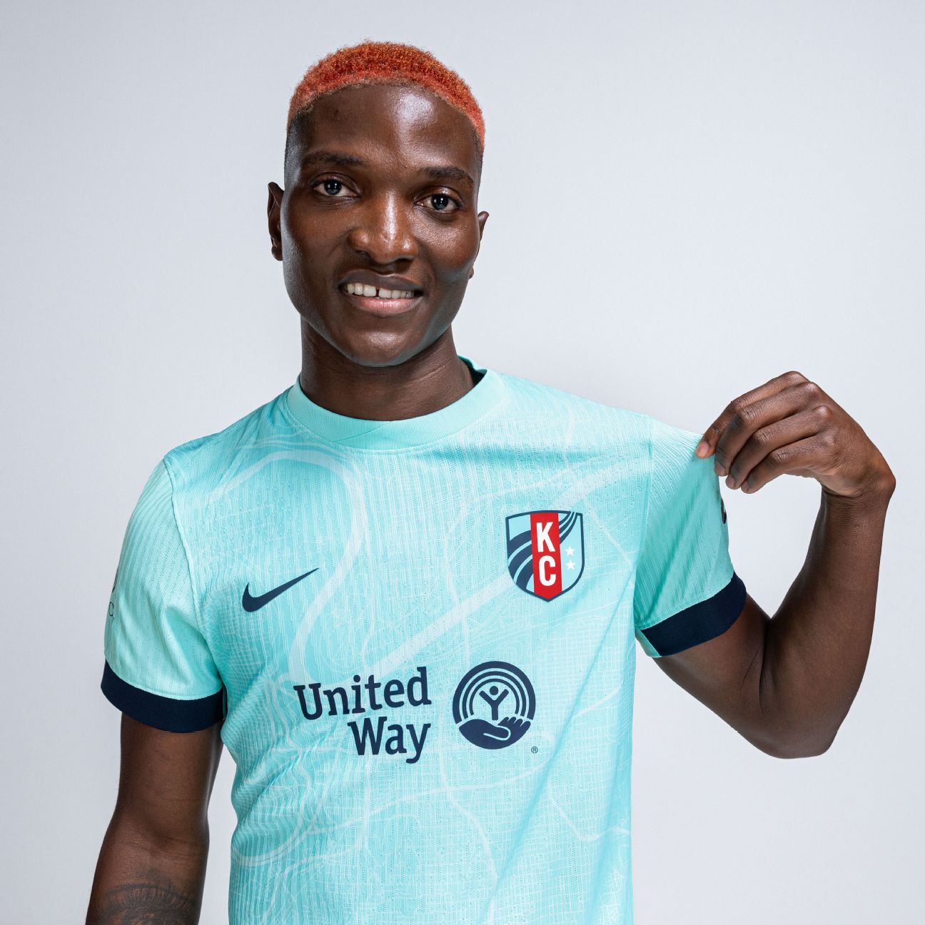
A perfect example of a secondary kit that looks fairly clean at first glance, and then more intriguing and beautiful on closer inspection. It's the first time Kansas City have used a full kit with their signature teal, which includes a map of Kansas City and the Missouri River.
Whether due to jersey sales or highlights from Temwa Chawinga's never-ending supply of goals, we'll likely be seeing plenty of this kit in 2025.
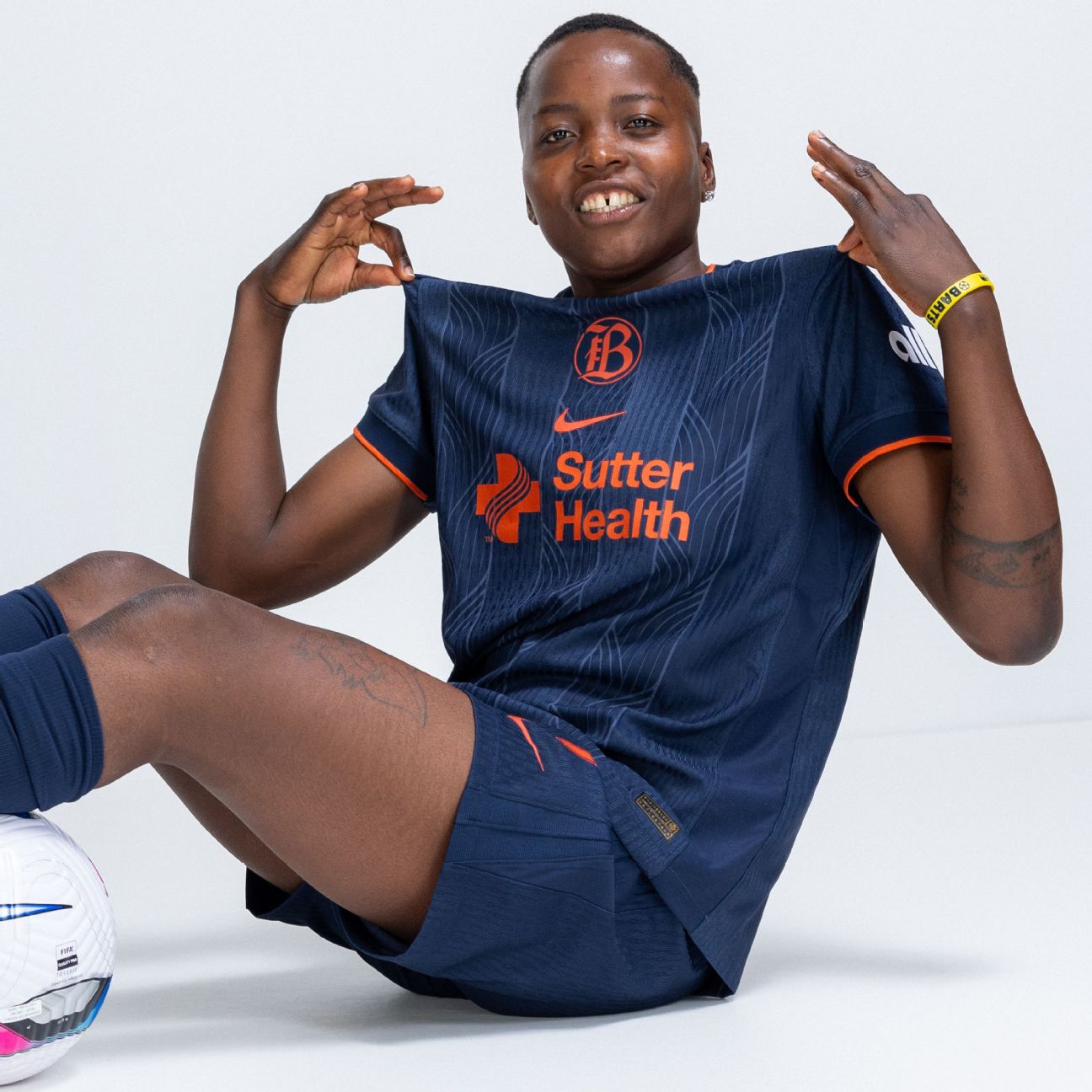
4. Houston Dash
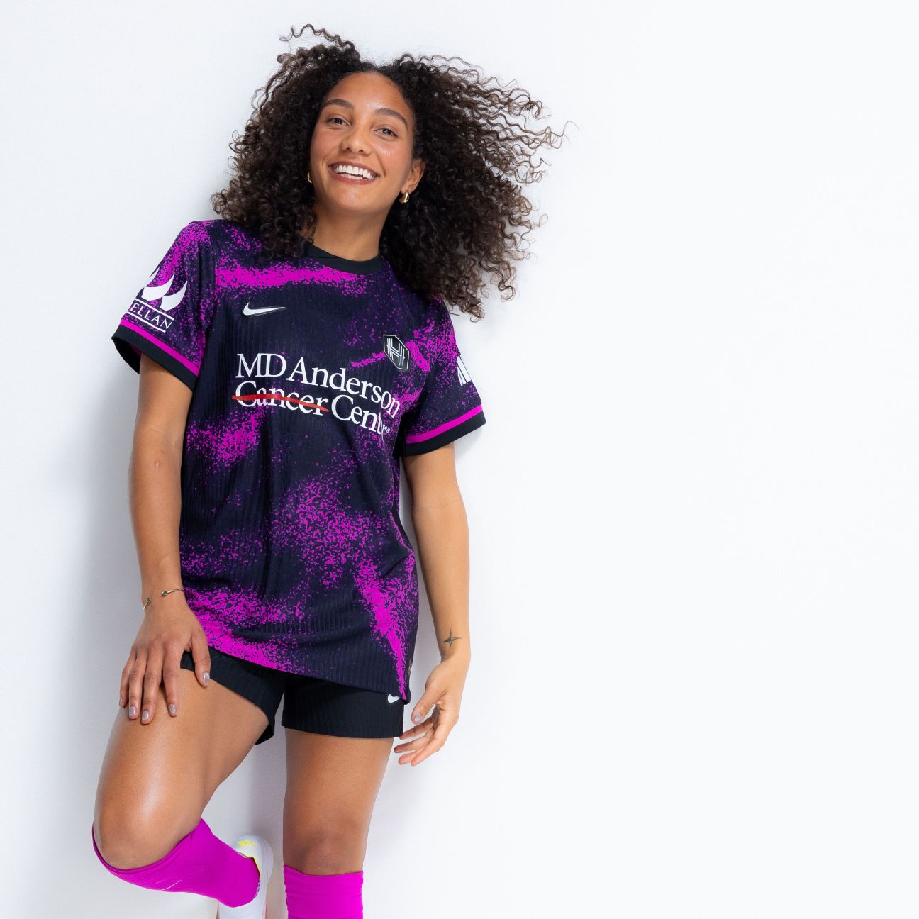
Goodbye, orange. Hello, black and purple.
Dubbed the "Cosmic Storm" kit, Houston's secondary is nearly flawless in their latest adventurous design that's supposed to signify a new chapter for the club. It might be a little too in-your-face for some, but there's no denying it's the most fun of the new releases for 2025.
3. San Diego Wave
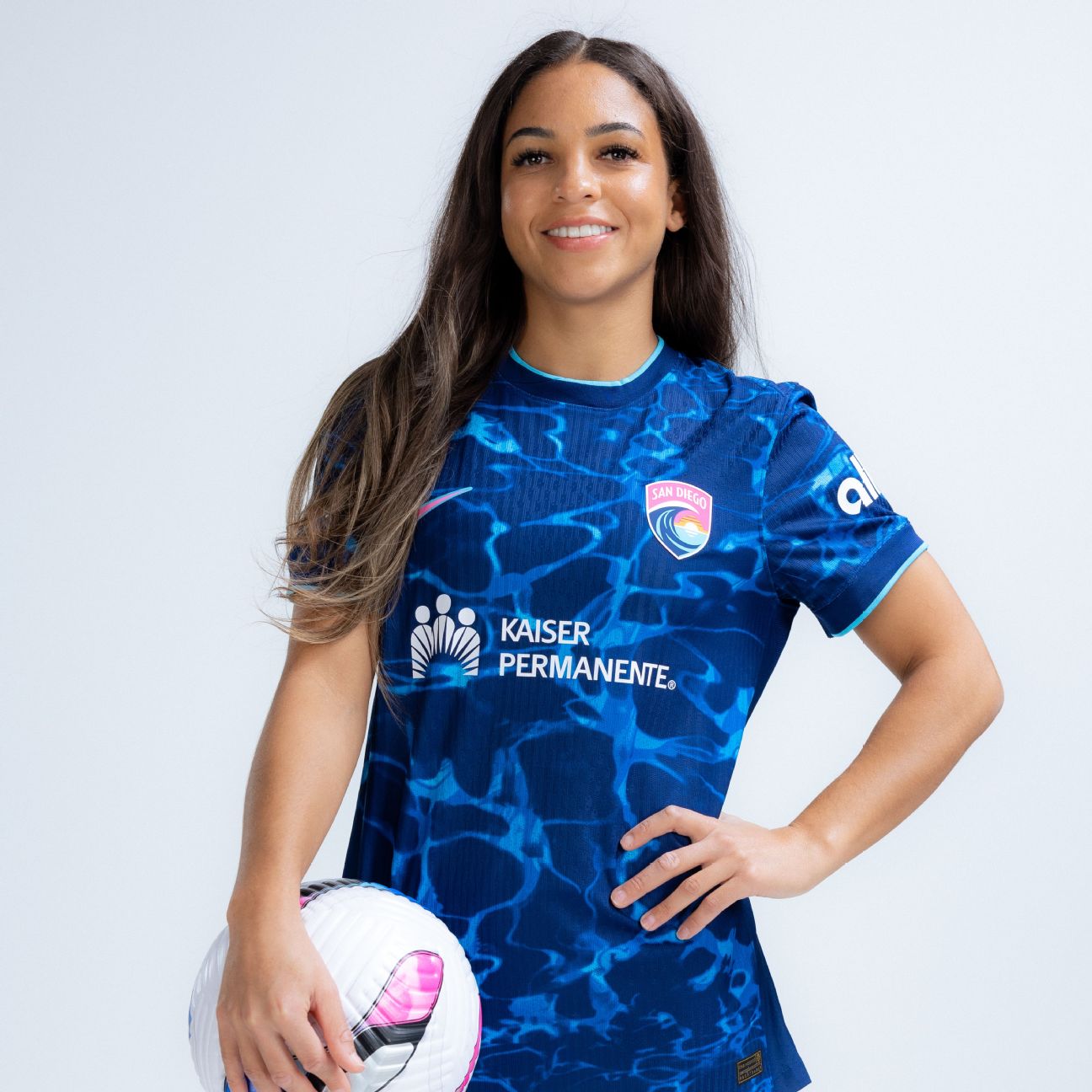
Almost as if compensating for the jerseys they wore during their first two years of existence, San Diego have been more daring since 2024 and have once again hit the mark with their latest secondary kit, named "Altamar." The reference to the ocean, although an obvious theme, was very skillfully carried out in the design.
2. Portland Thorns
If Portland were looking for something intimidating for 2025, well done. While 2024 felt more fun and bright, this year's primary seems to demand respect with the return of the red and black that symbolize "strength and unity within the city" and "the embers burning at the heart of the team and supporters."
If that doesn't get you fired up during a pre-game pep talk, I don't know what will.
1. Angel City FC
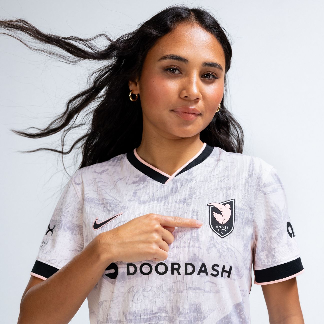
A+, 10/10. Angel City didn't just include one landmark or symbol, but a number of them through a toile pattern that makes this secondary feel closer to a work of art than a soccer jersey. It's somehow pleasingly complicated without feeling busy and something that should instantly be a fan favorite for their die-hard supporters.
It's going to be tough for them to surpass this jersey, which is a big compliment for the bar they just set.