Strikeouts are through the roof. Batting averages are in decline. Home runs? Still plenty of those. It's all part of the roller-coaster ride that is baseball history.
As the game changes through the years, we get peaks and valleys in our stats. The National League once hit over .300 as a league. In 1968, just six batters hit .300. Then batting averages went up again ... only to fall again.
Baseball statistics do tell the story of the game, always shape-shifting and always interesting. They reflect the history, the styles of play, the makeup of players, the strategies.
Below are some of the signposts along the way, as we chart the average numbers through the decades put up by qualified regulars and pitchers, and glance at the signature players of each era.
Here's how we got to here.

1. Home Runs: The Long Ball Lives
When home runs hit a 22-year low in 2014 and runs scored dropped to their lowest levels in more than 30 years, everyone freaked. Had pitchers become too dominant?
Home run averages by decade (per qualifying hitter)
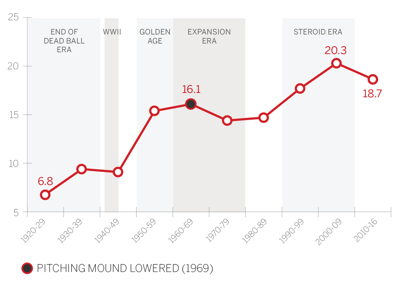
Well, home runs are back, bigger and almost better than ever. Last season saw the second-most home runs ever hit, as teams averaged 1.16 home runs per game, just short of the 1.17 mark of 2000. Thirty-eight players hit 30 or more home runs and the early returns in 2017 suggest we're headed for similar figures.
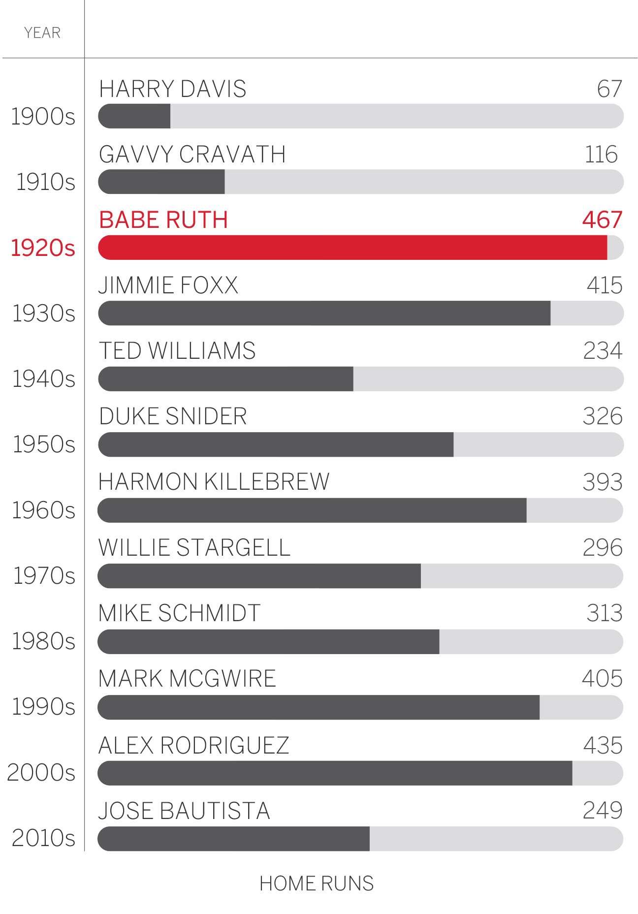
There have been three other eras when home runs spiked. The live ball era began in 1920 -- when dirty and scuffed baseballs were thrown out of play -- and home runs doubled from 1920 to 1929. Still, that game was built more around high batting averages than power, as 30-homer seasons remained rare (in 1933, only Jimmie Foxx, Babe Ruth and Lou Gehrig topped 30 home runs).
Home runs climbed again after World War II, for reasons including a new spate of sluggers like Ralph Kiner and Mickey Mantle; a redefined strike zone in 1950; bandbox parks; and an emphasis on what we now might label "Earl Weaver baseball" -- walks and three-run homers.
Other than the infamous rabbit-ball year of 1987 when home runs reached a then-record 1.06 per game, the next spike came in the steroid era. In 1996, a record 17 players hit 40 home runs. In 2000, a record 47 players hit 30. In 2001, Barry Bonds hit 73 home runs. It wasn't just the steroids. The new ballparks were smaller than the pitcher-friendly multipurpose stadiums of the 1970s and '80s. Some would say the balls were as juiced as the players. Thinner bat handles helped generate more bat speed. Slap-hitting middle infielders were becoming an extinct species.
Now, everyone swings for the fences.
Decade-by-decade leaders

2. Stolen Bases: Where Art Thou, Rickey?
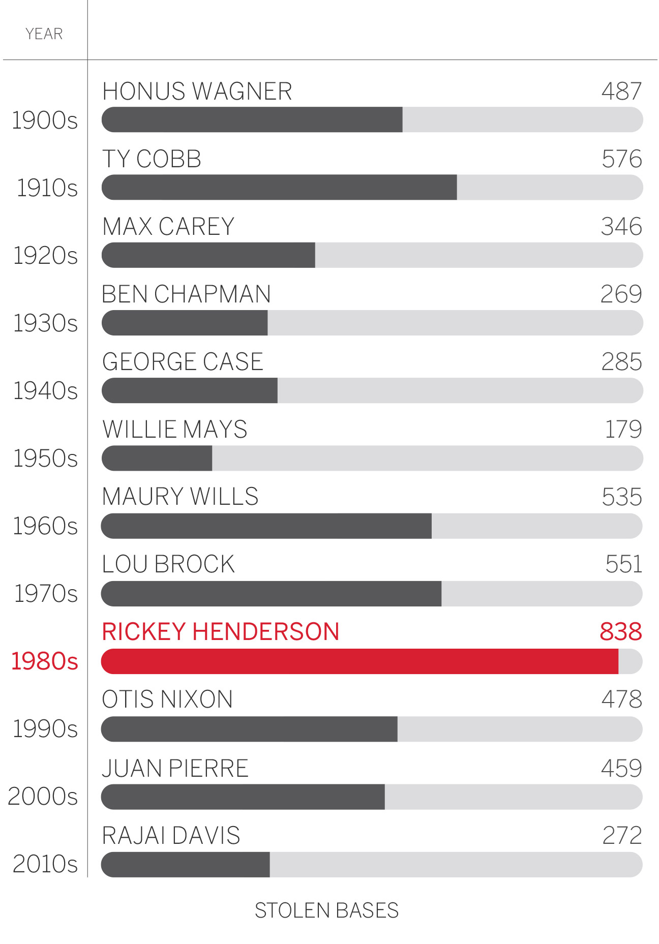
Stolen bases are hardly dead, but they are down from the per-game figures we saw in the 1980s. There were 0.55 steals per game in 2016 and five players stole at least 40 bases. Compare that to 1987, when there were 0.85 steals per game and 14 players swiped 40-plus bags. We also don't see the ridiculous individual totals of the 1980s: Rickey Henderson and Vince Coleman both topped 100 three times and Ron LeFlore, Omar Moreno and Tim Raines all reached 90. Jonathan Villar led the majors in 2016 with 62.
Stolen base averages by decade (per qualifying hitter)
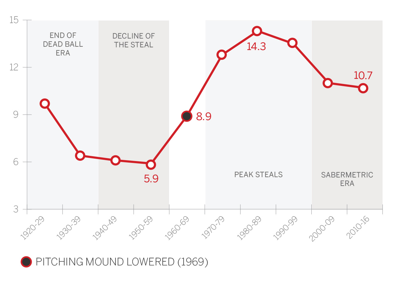
Peak steals actually came in the dead ball era, when home runs were nearly nonexistent, so teams had to scratch for runs. As offense increased in the 1920s, steals began a nearly 40-year decline. Players like Luis Aparicio, Maury Wills and Lou Brock helped bring the steal back in the 1960s, and the advent of those Astroturf stadiums in the 1970s led to an emphasis on speed.
Since then, several factors led to another drop in steals, including the slide-step for quicker deliveries to home plate; sabermetrics teaching that the break-even rate for steals was around 70 percent (success rates in the 1970s were in the low 60s); and the current game, with decreased batting averages and more home runs, means a stolen base is less likely to be followed by a base hit.
Decade-by-decade leaders

3. Batting Average: You Down With OBP?
This decade, the average regular has hit .272. For all the griping about the decline in batting average, that's not far off the historic norms. Yes, regulars hit .282 in the 1990s and 2000s, but that's just one extra hit every 100 at-bats. Can you tell the difference?
Batting averages by decade (per qualifying hitter)
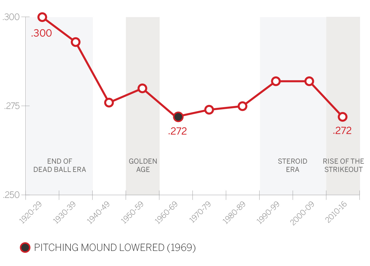
True, the increase in strikeouts means fewer balls in play, and fewer balls in play have led to lower batting averages. The overall league average was .255 in 2016 compared to .271 in 1999, but that .271 mark was also the highest since 1939.
Indeed, we've had several fluctuations in league-wide batting rates through MLB history, even as we still hold dear the idea of the .300 hitter. High averages reigned supreme in the 1920s and 1930s, never more so than the rabbit-ball season of 1930, when the National League hit .303 and 76 regulars across MLB hit .300. There were 122 regulars that season, so more than half of them hit .300.
As pitching improved and strikeouts increased, batting averages dropped. A belief that home runs had become too cheap led to a change in the definition of the strike zone in 1963 -- the upper limit was raised from the armpit to the top of the shoulders -- and that led to a huge decline in batting average in the 1960s. The MLB average in 1968 was .237 and only six players hit .300. That was a problem; the mound was lowered and the strike zone redefined in 1969.
In this era of power pitching and deep bullpens, hitting .300 is once again a tough task. There were 55 regulars who hit .300 in 1999; that was down to 25 in 2016. Plus, in the age of analytics, on-base percentage and slugging are more in vogue among evaluators than mere cobwebby old batting average.
Decade-by-decade leaders*
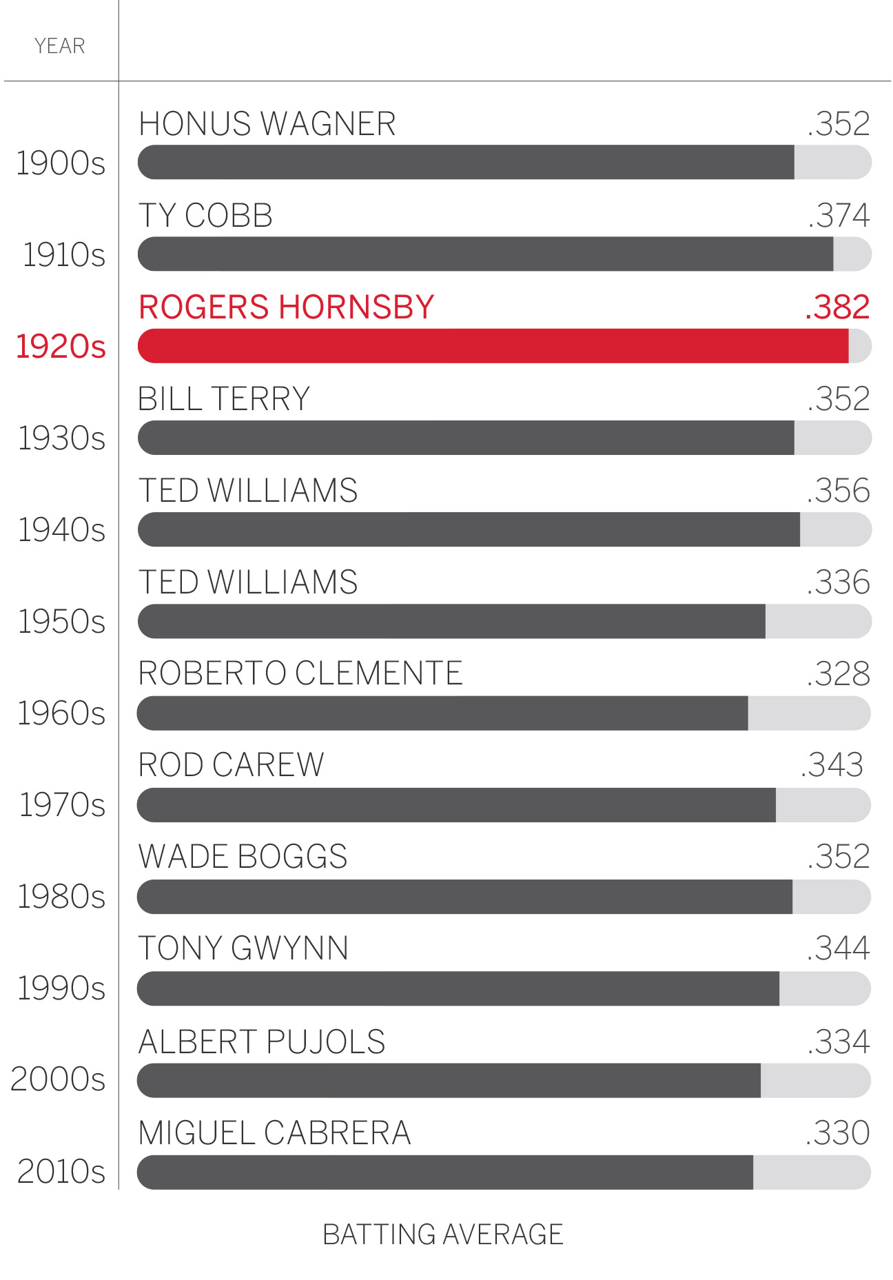
* min. 2,500 plate appearances; 1,750 for 2010s

4. Batter Strikeouts: All. Or. Nothing.
"Too many strikeouts!" is kind of the cranky old-school baseball fan's version of "Get off my lawn!"
Strikeout averages by decade (per qualifying hitter)
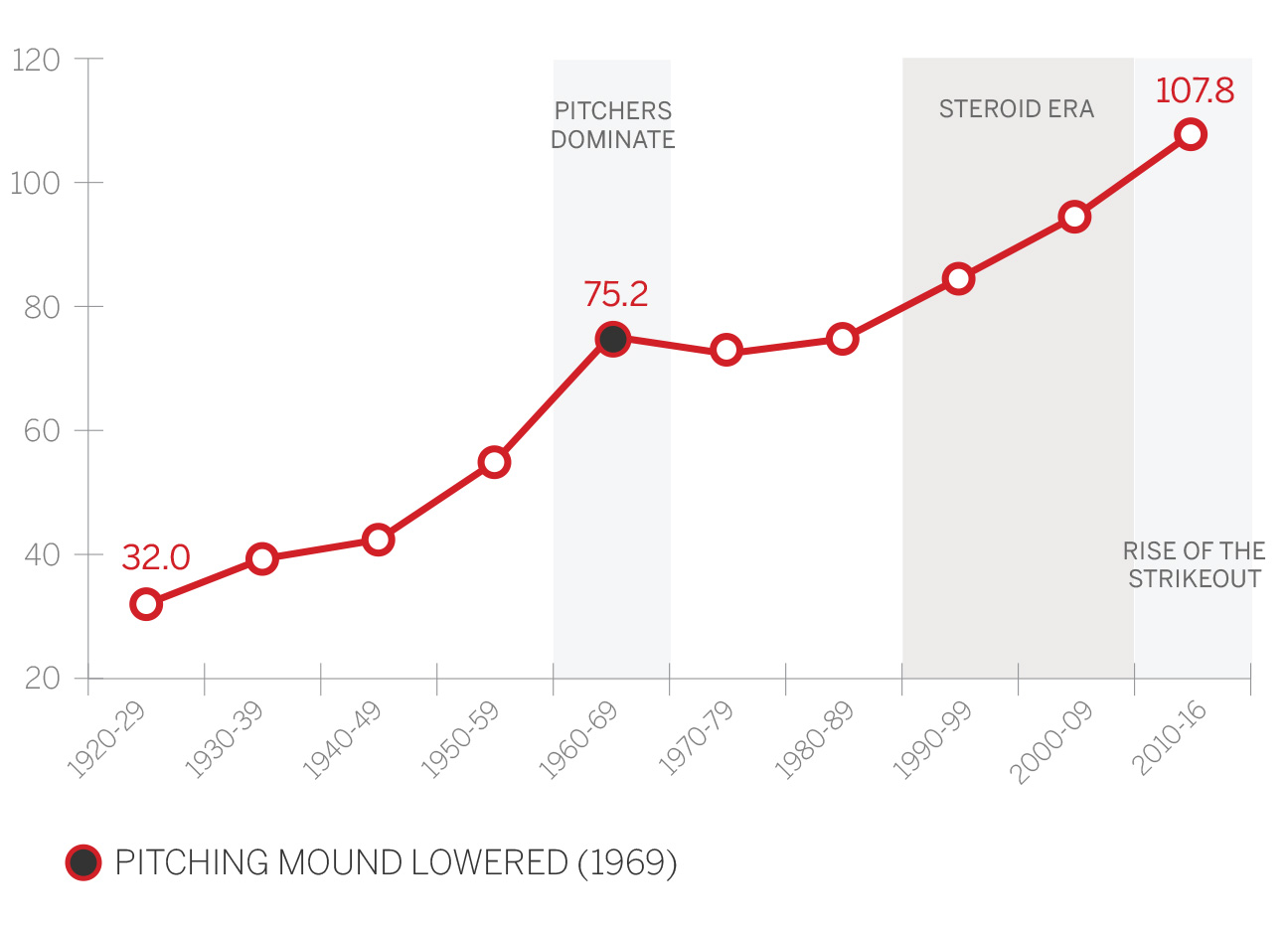
The chart is pretty self-explanatory: Strikeouts have basically been on a steady increase for 100 years. Pitchers are better! They throw harder! Batters are going to strike out more! And, yes, as batters try to hit home runs all the time, and care less about putting the ball in play, they're going to strike out even more.
Still, the numbers are a little numbing. In 2016, 102 players fanned 100 or more times. Just a decade before, in 2006, that total was 63.
There is no sign of this trend changing. The only time strikeout rates held steady was after the mound was lowered in 1969. In 1968, there were 5.89 strikeouts per game; that figure wasn't reached again until 1987. We hit six strikeouts per game in 1994, seven in 2010 and eight in 2016. Will we hit nine in 2020?
The skyrocketing strikeout rates are partly attributable to the increase in velocity over the past decade, as it seems every team has four or five relievers who can throw 95 mph. All the strikeouts have the commissioner worried -- and he has talked about shrinking the strike zone to get more balls in play.
Maybe the mound needs to be lowered again as well.
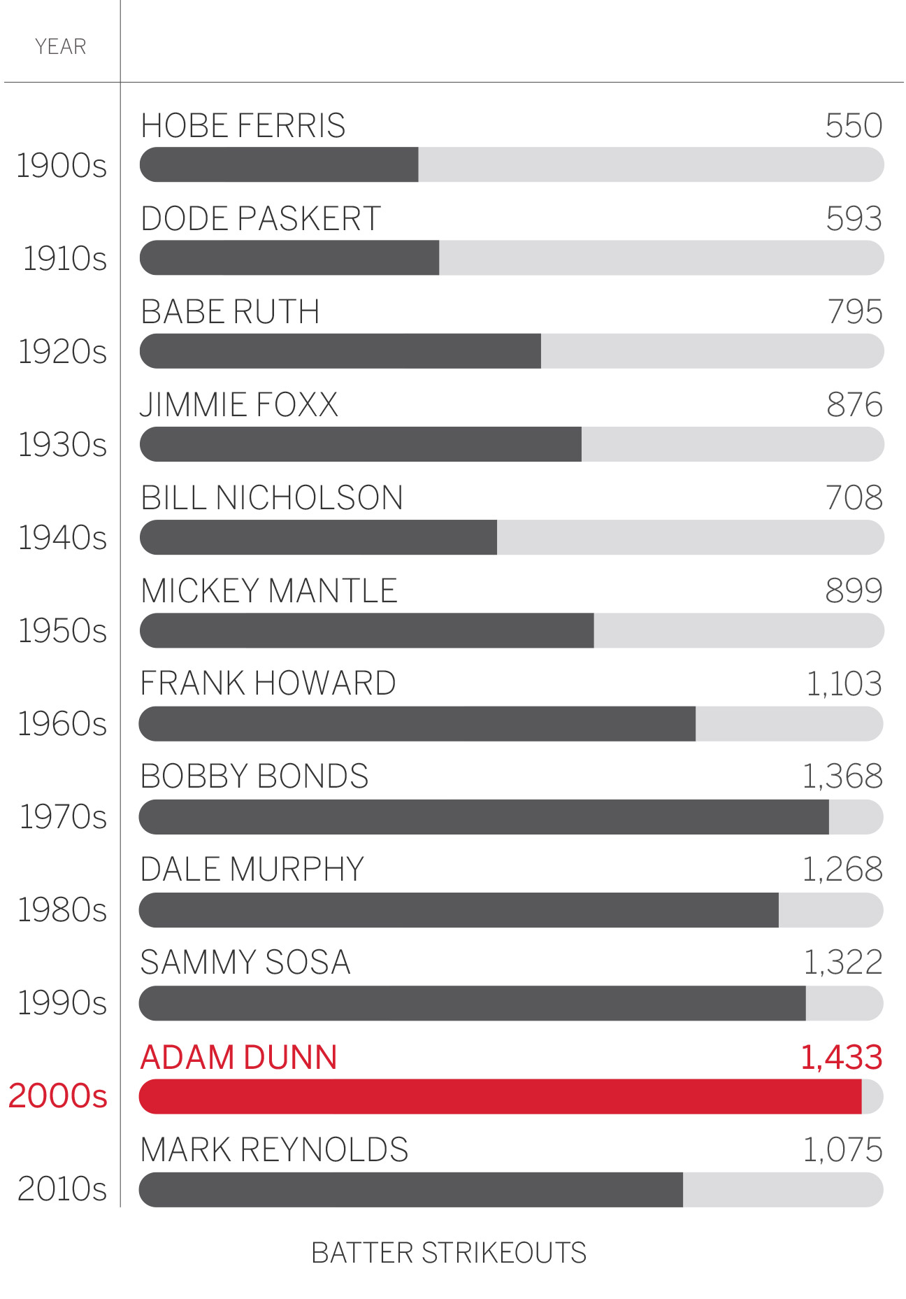
Decade-by-decade leaders

5. ERA: Shorter Outings, Larger Strike Zones
There were eight starting pitchers with an ERA below 3.00 in 2016 (all in the National League), and while that's fewer than the 22 we had in 2014, it's seven more than 2007, when Jake Peavy was the only qualified starter with an ERA under 3.00.
ERA averages by decade (per qualifying pitcher)
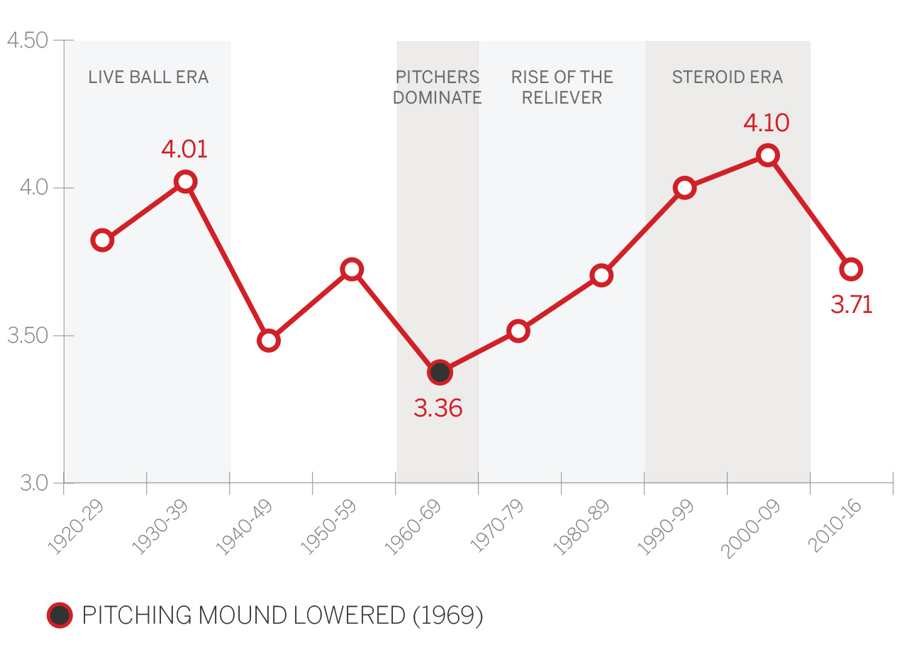
While the average ERA for starters rose to 4.34 in 2016 (the highest since 2009), the overall trend this decade has been lower ERAs. A major reason is the size of the strike zone has increased, mostly at the bottom of the knees. Starters also don't have to pitch as deep into games, averaging 24.1 batters faced per game in 2016 compared to 25.9 in 1996.
As you would expect, the two biggest changes in ERA came in the 1960s, when the bigger strike zone implemented in 1963 led to a run of pitcher-dominated seasons, and then in the steroid era in the 1990s. The 1960s culminated in the Year of the Pitcher in 1968, when 49 qualified starters posted ERAs under 3.00, including Bob Gibson's 1.12 mark. In the steroids era, starters' ERAs hit 4.82 in 1999 and 4.87 in 2000, higher even than in 1930. (Starters allowed a higher rate of runs in 1930, but there were more unearned runs due to more errors.)
Decade-by-decade leaders*
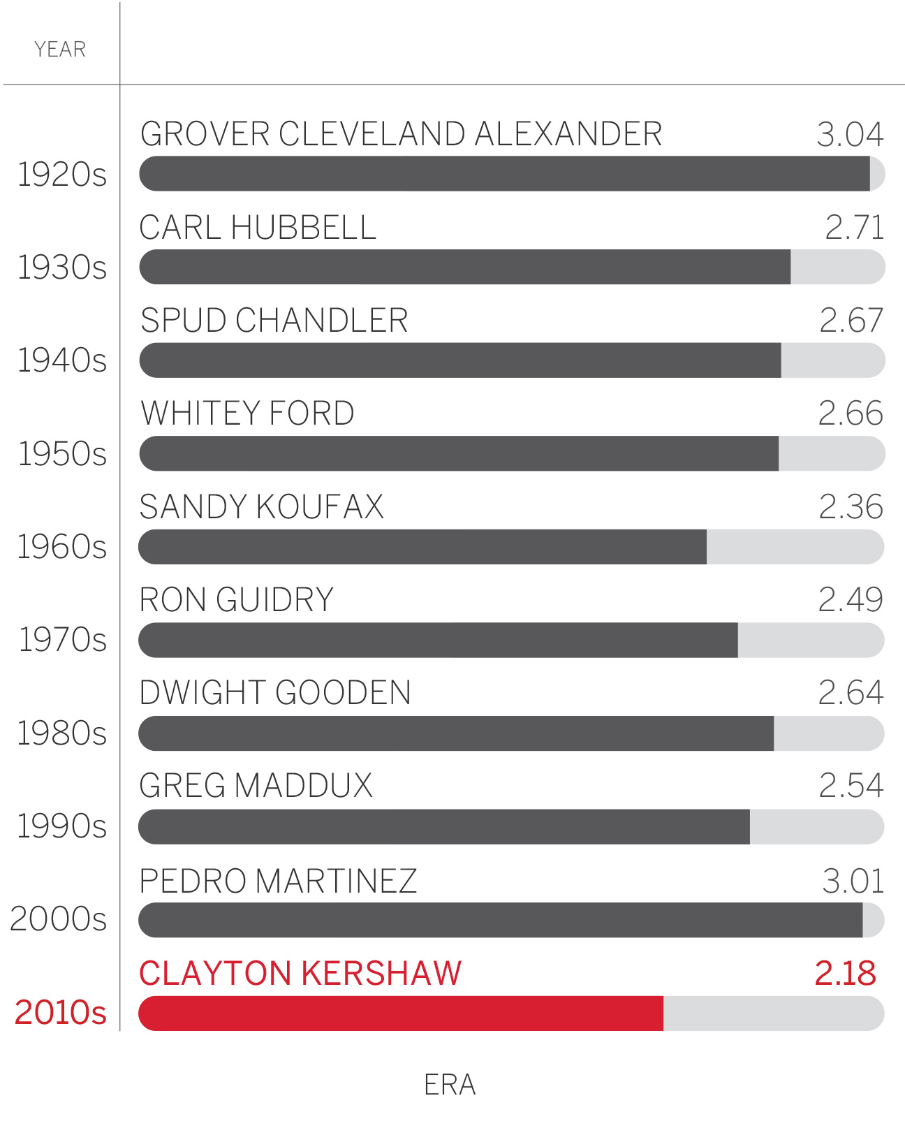
* min. 600 innings pitched and 100 starts

6. Pitcher Strikeouts: Just Blow It By 'Em
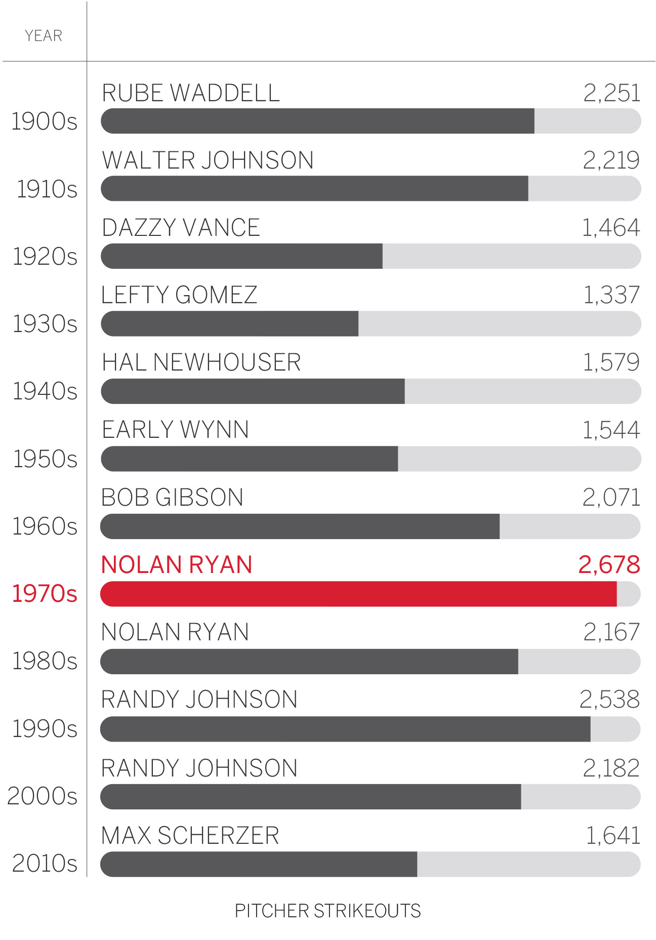
There was a time when a 200-strikeout season was a rare feat. In the 1950s, there were only seven such seasons the entire decade. In 2016, 12 pitchers reached 200 K's, led by Max Scherzer's 284. In 2015, 18 pitchers did it, the most ever.
Strikeout averages by decade (per qualifying pitcher)
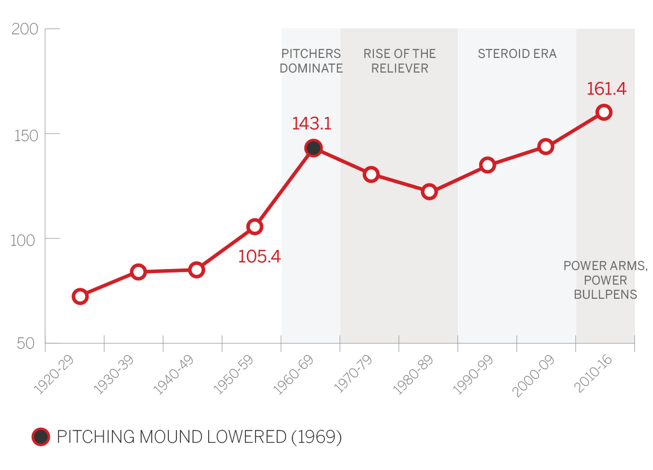
Qualified starters (at least 162 innings) have averaged 161 strikeouts per season this decade, and while that's not all that much higher than the 143 average of the 1960s, it doesn't adequately explain the increased rate of strikeouts. Keep in mind that fewer pitchers throw 200 innings a season now. Just 15 pitchers reached that total in 2016, the fewest ever in a non-strike season. The high figure in post-World War II baseball was 65 in 1974, and there were 56 who did it as recently as 1998 and 50 in 2005.
In a relatively short time, we've gone from an average of two starters per team throwing 200 innings to one starter for every two teams.
Decade-by-decade leaders

7. Wins: Pen = Mightier
Pitcher wins -- again, we're just looking at qualified starters -- haven't changed all that much, from highs of 13.6 in the 1920s and 1970s to a 12.5 average this decade. That makes sense if you think about it: The pool of wins is finite; it doesn't change.
Wins averages by decade (per qualifying pitcher)
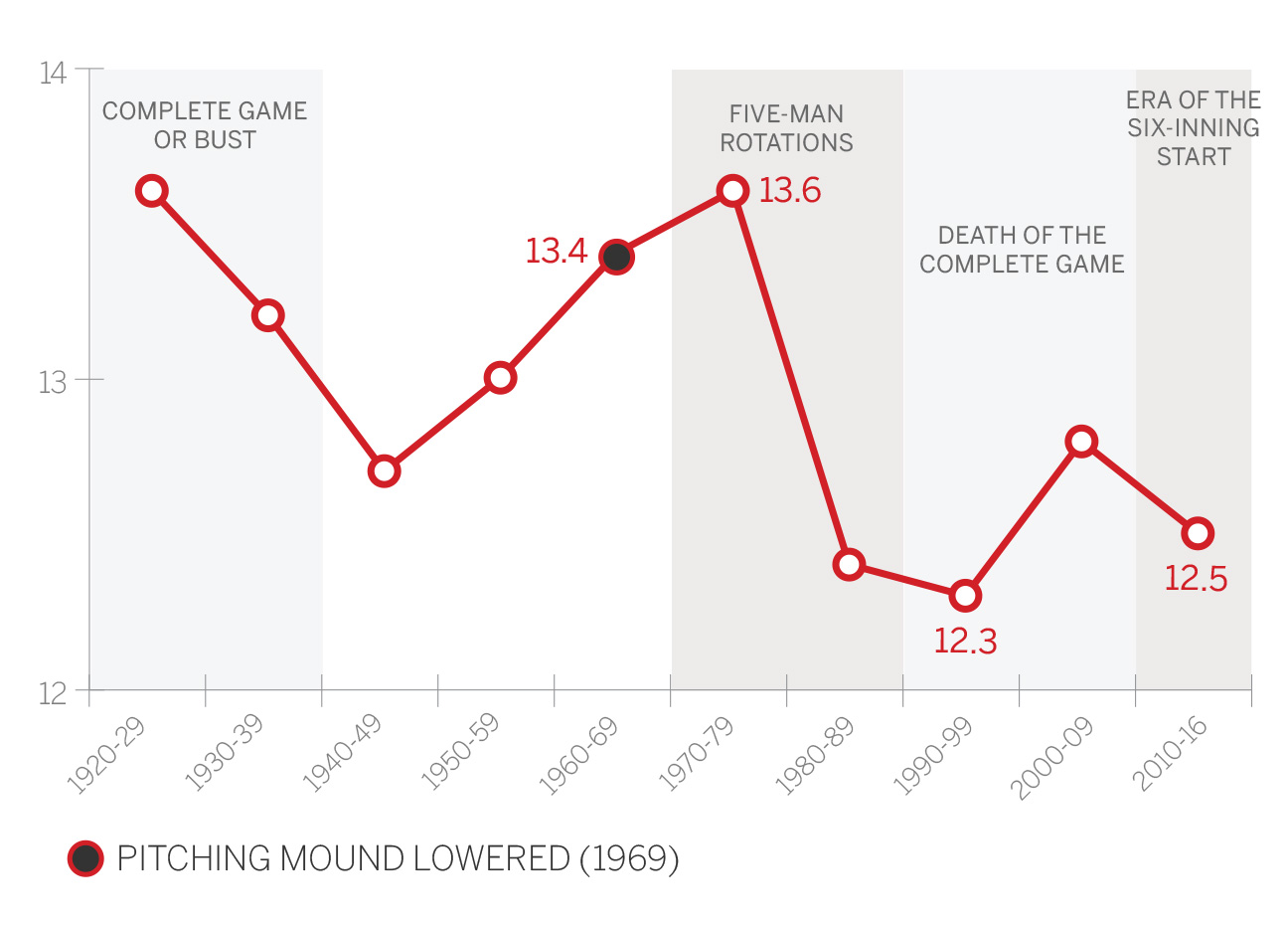
That number might start dropping, however. Bullpens are getting more decisions as starters are pulled more quickly from games. We mentioned 2005, when 50 starters pitched 200 innings. If you pitch more innings, you're more likely to be involved in the decision. That year, starting pitchers totaled 1,741 wins. Last season, when only 15 pitchers threw 200 innings, starters received credit for 1,628 wins.
The traditional standard of 20 wins remains a high bar, with just a few pitchers getting there each season. There were three 20-game winners in 2016, two in 2015, three in 2014 and one in 2013. The peak for 20-win seasons came in the late '60s and early '70s, when many starters threw a huge number of innings. There were 15 20-game winners in 1969, 14 in 1971, 13 in 1973 (and 1951) and 11 in 1970 and 1974. As the five-man rotation became standard by the 1980s, the 40-game starter became obsolete. Then the complete game neared extinction.
Maybe the 20-game winner is next on the endangered species list.
Decade-by-decade leaders
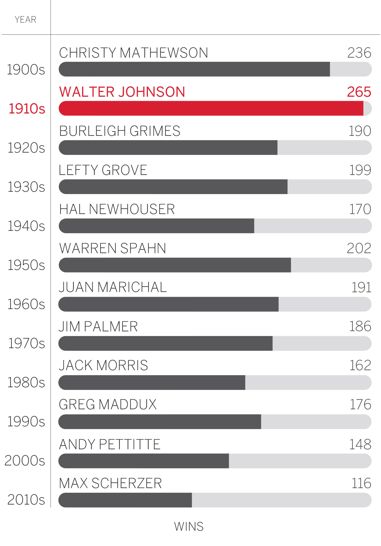
Average numbers by decade provided by Elias Sports Bureau, Inc. Decade-by-decade leaders researched by Mark Simon of ESPN Stats & Information.
